If you’ve read our previous post about landing pages, you’ll know why they are so valuable. Now you need to know what to do to make your landing pages successful. Creating a landing page is not just as simple as a page title and a form, there are some key best practises that you must follow.
Download The Simple Way to Create Landing Pages Tip Sheet.
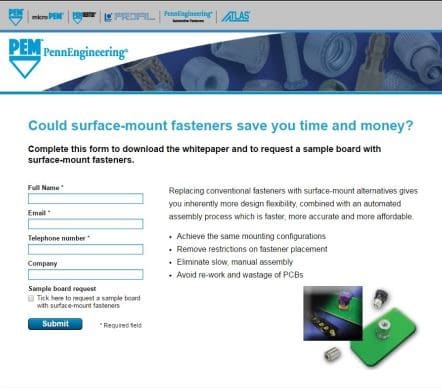
Headline/Page Title – Your headline is the first thing that visitors see so it needs to be clear and sum up your offer accurately and meet visitor’s expectations.
Body text – Again this needs to clearly explain the content offer that will be given and show the true value of this, it should compel visitors to want to give you their prized personal details. This text needs to be short and simple, so bullet points are ideal as they are easy to digest.
Call To Action – This is the main event, this is why people have come to your landing page as it is the key to getting hold of the content so your call to action needs to stand out. If you’re using a button with overlaid text make sure to include an action word such as ‘get’ or ‘download’ so people feel compelled to take action.
Images – An image can really boost the effectiveness of your landing page if it is relevant and helps to spell out what your content offer is.
Keywords – You’ll no doubt have keywords that are relevant to your business and as with any of your other content, your keywords should be present on a landing page too in the title and the body text.
Lead Capture or Conversion Form – It goes without saying that you need to have a way of capturing your lead data. Make sure your form includes a sensible number of fields and asks for the right information. You might have the option to make some fields mandatory but making all fields mandatory can be a turn off, but only if your content offer doesn’t seem valuable enough. Don’t forget to ask for an email address or contact number. You may also have the option of using a verification service like captcha but ensure that if you use such a service it is not difficult to use as this would be an obstacle to potential conversions.
Remove Navigational Buttons/Other Links – A landing page needs to be free from distractions such as links to other pages or other offers, if it is to be its most successful. If you are trying to convert a visitor to a lead don’t confuse or distract them or give them the option of going elsewhere.
Social Sharing Buttons – There’s nothing more valuable than word of mouth advertising and this can translate online too. If a visitor sees real value in your content they might choose to share it with friends and colleagues…but only if you give them the option to! By including social sharing buttons you increase the likelihood that your supporters will promote your content for you, giving you even more opportunity to reach a wider audience and get more leads.

Now you know what you need to include on your landing page, there’s nothing else to do but take the plunge! If you want further advice on creating landing pages then download our tip sheet.
Author
-
Sophie worked with Napier in content development and account management for several of our accounts. She's now moved on to an in-house role.
View all posts

