As we’ve discovered through previous blog posts, there are a number of key factors that can influence the success of your landing page including title, explanatory text and a good content offer but the crucial piece that brings all this together is the form. In this blog post, find out the 3 key elements that make a successful landing page form that converts.
If you’re in a hurry, Download The Simple Way to Create Landing Pages Tip Sheet.
Form Design
Use form encapsulation when you can. The conversion goal for any landing page is the form so it needs to be positioned front and centre and encapsulated in a container which allows critical content above it to connect visually. Your form needs to draw attention. See our previous post The Anatomy of A Landing Page for more info.
Form Length
Following tests from Unbounce (creators of a landing page building and publishing tool) on establishing the ideal number of form fields for optimum conversion, the conclusion has been that it varies. Depending on the perceived value of the offer, between 4 and 7 fields will provide a good conversion rate. Anything between 1 and 3 fields provides better results as your potential lead experiences less friction. If you have more than 7 fields on your form, your content offer needs to provide AMAZING value.
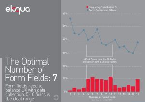
Marketing experts Hubspot have written many blogs on this very topic and this chart by Eloqua indicates that 5-10 fields is the ideal range for optimum conversions.

Hubspot have run their own research and their conclusion was that as the number of form fields increases, conversion rates decrease slightly but not too steeply. They did discover that text area and drop-down form fields seem to be the ones that are most off-putting to potential leads.
So who is right? In reality there is no right and wrong, or a magic number that will mean your landing page hits the lead generation jackpot. What is evident from both parties is that when creating a landing page, you need to decide whether you want a higher number of leads or better quality leads. If you want better quality leads you have to consider what valuable offer you are going to leverage to get landing page visitors to convert and become leads – when you provide more value with your content offer you can ask for more information. If your leads take the time to fill in a longer form that means they are clearly interested, which is great news.
Form Placement
The general rule for the position of the form is to place it above the scroll on the page. Going through infinity scroll pages to find the form is not what visitors are expecting nor what they desire to do. However, if your landing page has more information to present before considering the offer, such as an event (agenda, location, times, benefits etc) then place it at the bottom of the page.
These 3 tips should have you well on your way to creating a fantastic landing page that converts visitors to leads. For more information, Download The Simple Way to Create Landing Pages Tip Sheet.

