Brand Guidelines: A Guide to Why, Where and How
Brand guidelines are essential in today's ever-expanding business world. Companies must look for ways to connect emotionally with customers and create everlasting relationships. Although it may feel like a cliché, the truth is people can fall in love with brands in B2C and B2B environments.
Whatever the stage of your company, or how strong your marketing strategy is, there are often still misconceptions about brand guidelines and why they are important.
The Importance of Brand Guidelines
What are ‘brand guidelines’? They are a set of tools/resources designed to give your brand consistency and flexibility. Designers most often reference these to ensure they’re using the right fonts, colour palette, and logo versions, however, effective guidelines should be much more than that. They should be seen as a defined resource that everyone in the company can refer to, to ensure the brand is represented consistently and communicated effectively with customers.
Here are five reasons why brand guidelines are so important:
1 - Define a Clear Understanding of Your Brand
Brand guidelines are used by employees to understand and reflect the company values in the way that they interact with customers. Everyone should have a clear understanding of what makes your company unique.
2 - Consistent visual communication
With brand guidelines in place, you can ensure your brand’s elements are being used effectively and look professional on every occasion they are used. Guidelines give companies control over the way others use their brand so that its visual appearance is always consistent.
3 - Build Relationships
You can use brand guidelines to illustrate relationships between a company and the stakeholders associated with it. If you have partners or affiliates, provide them with guidelines to help them represent the brand accurately and effectively.
4 - Adding Value
The value of a brand is essential to a company. When a brand's identity is cohesive, it increases the brand's perceived value and allows your company to appear more professional and reliable. With brand guidelines in place, it is easier to maintain the quality and integrity of the brand's image.
5 - Perception
Every time you communicate with customers, suppliers, employees, investors, journalists, and the community, it is essential to set, build, and keep a consistent perception of your company. Brand guidelines provide an easy way to do this, especially when different departments handle communication to different areas of the target audience.
What elements should be considered when creating brand guidelines?
There are several key elements which should be created when designing brand guidelines, to ensure your document is concise and effective.
Logo
All variations of your logo should be included, and it should also highlight any sub-branding.
The primary logo is the main focal point of your branding and the image that will be used most often. Your brand style guide should include all variations of your logo, including your primary logo, secondary logo and taglines, where applicable.
Logo Usage
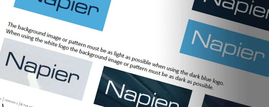
With many variations of your primary/secondary logo(s), the guide should be used to identify which logo to use for any given scenario. The main things to consider are background colours, and the use of watermarked images and patterns. Make this clear on when to apply in any given variation.
To ensure that your logo can be seen clearly across all communications, establish a minimum size for the logo to be used for print or digital assets.
Lastly, make sure you state rules for things to avoid such as:
- No skewing/scaling the width or height of your logo
- Choosing any unapproved colours
- Rotating the logo
Colour Palette
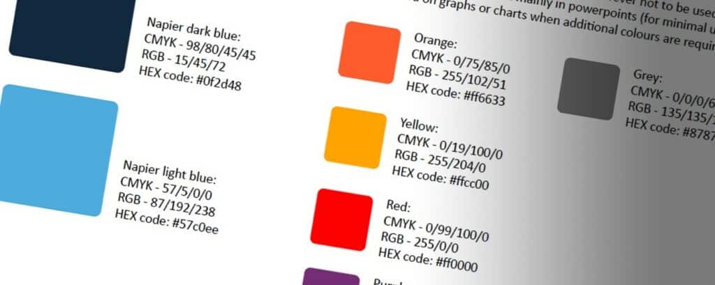
The branding colours chosen can be the most recognisable aspects of your overall branding.
There are no restrictions on how many colours can be used, however, you would normally expect to see very few primary/secondary colours, enhanced by more supporting colour options. This can be a time-consuming part of creating brand colours and time should be spent to make the best choices.
If a brand is modern or conservative then you may want to stick to a minimal amount of colour, whereas a bright and friendly approach may dictate the use of multiple bright colours.
Once deciding your brand colours, assign the colour codes in your brand style guidelines to ensure the exact colours are used across all forms of communication. Web design colours are often referred to as HEX Codes. An example of this is #FFFFFF (which equates to white). Digital-based assets usually are created using the RGB colour palette and print would generally use CMYK or Pantone colour codes. It’s important your brand guidelines cover all colour codes to maintain consistency across the organisation.
Fonts/Typography
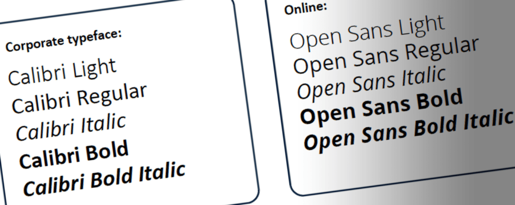
Fonts can be very important and sometimes overlooked when establishing a set of brand guidelines. This should reflect your brand and give the appearance of how you would like your company to be perceived.
Again, there are no restrictions on how many to use but generally, you would consider two font families. This would be listed along with the variations of that particular font.
Imagery
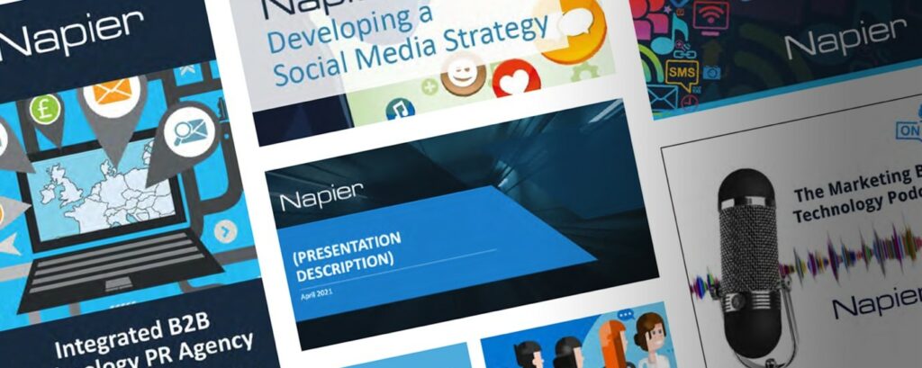
It is important to establish image guidelines for your brand to help maintain consistency across all platforms including your website, email marketing, social media and print marketing materials.
Be descriptive and provide examples of appropriate visuals, it is just as important to identify what is NOT appropriate as it is to highlight the styles that are accepted.
Conclusion
Branding to any company should be the very soul of its business and should encapsulate everything about it from the look and feel, to the personality in which it should be perceived by others.
Recognition is more important now than it ever has been before. The world is a wash of digital marketing activity and can be seen across multiple different platforms. Make people recognise your brand using consistent and methodical approaches. It is up to you to create a powerful identity and to make your voice heard.
Interested in how we can help you develop brand guidelines? Why not get in touch, we’d love to hear from you.
7 Current Trends in Graphic Design
The last couple of years have been unprecedented, and companies have been faced with challenges to adapt the way they communicate with customers, with statistics, numbers and facts becoming a defining element of communication.
Rob Furby, Creative Services Manager at Napier, shares how this shift in communication has affected the current landscape of graphic design, and what trends can be seen, as marketers adapt their approach.
Large Typography
Large typefaces faded away but are now becoming popular again. Brands want their visuals to make an impact and large font sizes are now the preferred method. A large font can help a campaign stand out in a busy digital world, as companies compete for the same space. Large typefaces, are not only a fun style to develop but also can add some personality into brands. Large typography is also extremely easy to implement into a multitude of campaigns such as logos and digital/printed material.
The example below shows the impact that a bright colour can have set against a lighter background.
Serif Fonts have Made a Comeback
Fonts play a crucial role in the world of brand design. The font landscape is also constantly changing.
2022 has seen a return to more traditional and classic font choices, such as serif fonts. Sans serif fonts are still popular – but they have been a bit overused. As a result, we’re seeing companies turn to serif fonts and even handwritten scripts for branding visuals. This is a great way to visualise tradition while also appearing elegant and sophisticated.
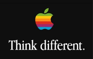
Below is an example of where Apple has used a serif font called Apple Garamond - serif fonts can be a good choice for brands that are setting trends rather than following them,.
Fun Data Visualisation
Data visualisation or ‘datavis’, is the future of business strategy and it is changing in front of our eyes. Gone are the days of carefully filling in graph paper squares by hand - modern datavis will trend more towards being fluid, and capable of accurately portraying data sets.
Customers are now more comfortable seeing charts and graphs in everyday professional situations so make the visual more engaging and memorable but in a fun way.
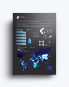
The infographic below vividly brings to life some important data about water consumption, making clever use of graphical symbols and pictograms to drive home its message.
Colourful Icons and Illustrations
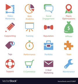
Colourful icons and illustrations are being used as a way to promote personality into branded visuals. This style breaks the monotony of a photo-focused social media approach, which makes them a great style for grabbing attention.
Colourful icons and illustrations are also a great way to add a fun and approachable style to your design.
Icons featured in the image, lead the eye to your content or menus. For maximum effect and visual appeal, they should adopt a consistent style.
Custom Brand Visuals
In the past year, there has been a rise in the use of custom photos and illustrations, most notably, in web design. Companies and designers alike are looking for ways to add interest and creativity back into their designs.
There are a few main reasons for this. The first of these is the ability to customise photos and illustrations to help brands stand out from their competitors.
Secondly, custom visuals are much more engaging than stock photos. When people see something that looks unique and personal, they’re more likely to engage with it. The main drawback of this approach is the time and resources required to produce these branded visuals, however, this is time well spent.
There is so much visual ‘noise’ online, that it is more important than ever for businesses to find ways to be individual. Custom visuals can provide a way to achieve this.
Vivid Neon Backgrounds
The trending style for background colours changes every year. 2022 has seen a rise in the use of neon backgrounds – loud, bright and attention-grabbing.
Neon backgrounds are being used, especially in new logo design trends that use these neon colours. One downside of neon background creation is that these can be complex to produce. You will need someone on your team with strong design skills if you want to create unique visuals yourself.
The Rocka website, as featured below, builds its full website design on vivid neon colours which change as the visitors scroll, ensuring they stay engaged.
Branded Memes
Personality can be hard to promote in B2B digital marketing, but memes can be a great way to display this as well as being able to add humour to a brand. Branded material can also be easily repurposed which can help build an instant connection with their audience.
The biggest positive is being able to get your brand in front of people in an inexpensive way.
Summary
The graphic design landscape is continually changing, and it will be interesting to see which trends are a passing phase, and which are here to stay. It's clear to see though that a combination of style and processes are needed to make an impact.
5 Ways We Help Our Clients Build Effective Graphic Design Campaigns
In the second blog of our Design series, Rob Furby, Creative Services Manager at Napier, shares how he works with clients to build effective graphic design campaigns.
Having spent 14 years at Napier, I have seen the rapid change in mindset required to strive in this ever-changing industry. A combination of passion and determination to succeed has ultimately helped me to become a strong member of this well-established design team. As the industry has evolved, so has design, and we have had to adapt, to ensure campaigns include the development of emails, video content and product ads, just to name a few.
In this blog, I share the five key ways I work with clients to build effective design campaigns:
Use empathy
Empathy is the ability to learn how to value somebody else's experience. This helps to prevent designers from developing ideas that could be considered self-expressive.
Often when a designer attends clients meetings, it's clear that all the information shared can be relevant in some way, and it becomes our responsibility to take this information and unravel it into a cohesive story. Often, a client can be unsure of what exactly they are looking for, and so we are able to offer viable design solutions to their requests/problems.
Ask questions
By asking questions, parts of the brief can be pieced together and help formulate a ‘story’ approach to a concept. This could typically be the standard who/what/where/when or could be as simple as a choice between two colours.
Asking questions helps to engage clients. Every answer equates to a better understanding of the clients’ needs. This also assures the client that there is genuine interest in wanting to offer the best solution(s) available, leading to better empathy.
Build trust
There is huge value in building trust with clients. This presents an opportunity to have the confidence to offer additional value, which will ultimately strengthen the professional relationship. Trust can alter the clients’ perception of a designer from that of a ‘contractor’ to a ‘consultant’ – someone who strives to offer that little extra, to enhance the rapport.
A design role isn’t just about creating nice looking designs but also providing value and solving problems in an effective and creative way.
Always test your design
I often present concept ideas to clients early and frequently. It's important to not get hung up on the fact that a first draft needs to look like the finished article before it is shared. This actually allows feedback from others, including the client. Let’s not forget that the client will have a good understanding of their customers so that a collaborative approach can only be a positive thing.
Design is a team sport
Every good design is often the result of multiple ideas from multiple people, whether that be designers, the clients themselves or project managers. If three designers are given the exact same brief, there would be three different visual creatives.
Collaboration within a peer group of designers will always result in a more thoughtful creative process. Who doesn’t feel more inspired than working within a great team? No designer can ever know everything and should always work to improve skills, techniques and ideas, and where better to do that than with a team of like-minded individuals.
Interested in how we can help you develop your next design campaign? Why not get in touch, we’d love to hear from you.
Why Video is STILL the Future of Content Marketing
Video marketing has quickly become a key player within a marketer’s content marketing strategy. With the digital landscape shifting significantly over the last few years, marketers now have no choice but to deliver their content the way consumers want it.
Yet, some marketers are still not convinced that video marketing is the way of the future. Luckily, video engagement is analysed by all the top industry sites and big players like YouTube, who are not shy to share their findings on why video is so important to the future of content marketing.
YouTube has revealed the following statistics about marketers using video and the numbers speak for themselves on why video STILL offers great ROI…
- 93% of marketers are using video in their campaigns
- 84% of marketers are using video for website marketing
- 60% of marketers are using video for email marketing
- 70% of marketers are optimizing video for search engines
- 70% of marketers will increase spend on video during the next year
- 82% of marketers confirmed that video had a positive impact on their business
How video content is received in B2B markets…
- 92% of B2B customers watch videos online
- 43% of that demographic researches services or products for their business through online videos
- 76% of B2B marketing professionals include video marketing as part of their overall digital strategy (B2B Marketing)
But in order to really get an idea of how video could be leveraged to increase a brand’s social media presence, YouTube statistics provide great insight:
- 500 years’ worth of YouTube video are watched on Facebook every day. YouTube is the world’s second biggest search engine after Google (Reel SEO)
- YouTube accounts for 28% of all Google searches.
- More than 1 billion viewers watch its videos each month, clocking over 6 billion hours (YouTube).
- One hour of video is uploaded to YouTube each second, more video is uploaded to YouTube in one month than the 3 major US networks have created in the past 60 years.
Please take a few minutes to check out our latest Video projects from the Napier YouTube channel. From there you can see great video examples from our designated project playlist.
Check Out Napier’s Latest Video Projects
If we can help you with your video content, Get in Touch and speak to a member of our video team.


